3 PM: so far, this is where i'm at with revisions, BELOW right is an hour ago, left: 7/15. in general, there are fewer whites that are pure white, the ferns in the upper left seemed to be an unnecessary distraction, the bottom figure's blouse is more of a pinkish color, and the area surrounding her is mottled rather than a flat color and the table top has a few reflections from the throw draped over the sofa.
if you look at the revised version in quadrants and compare it in that way, you'll see the impact on the eye of the changes i made. especially, i think, the lower and upper left areas.

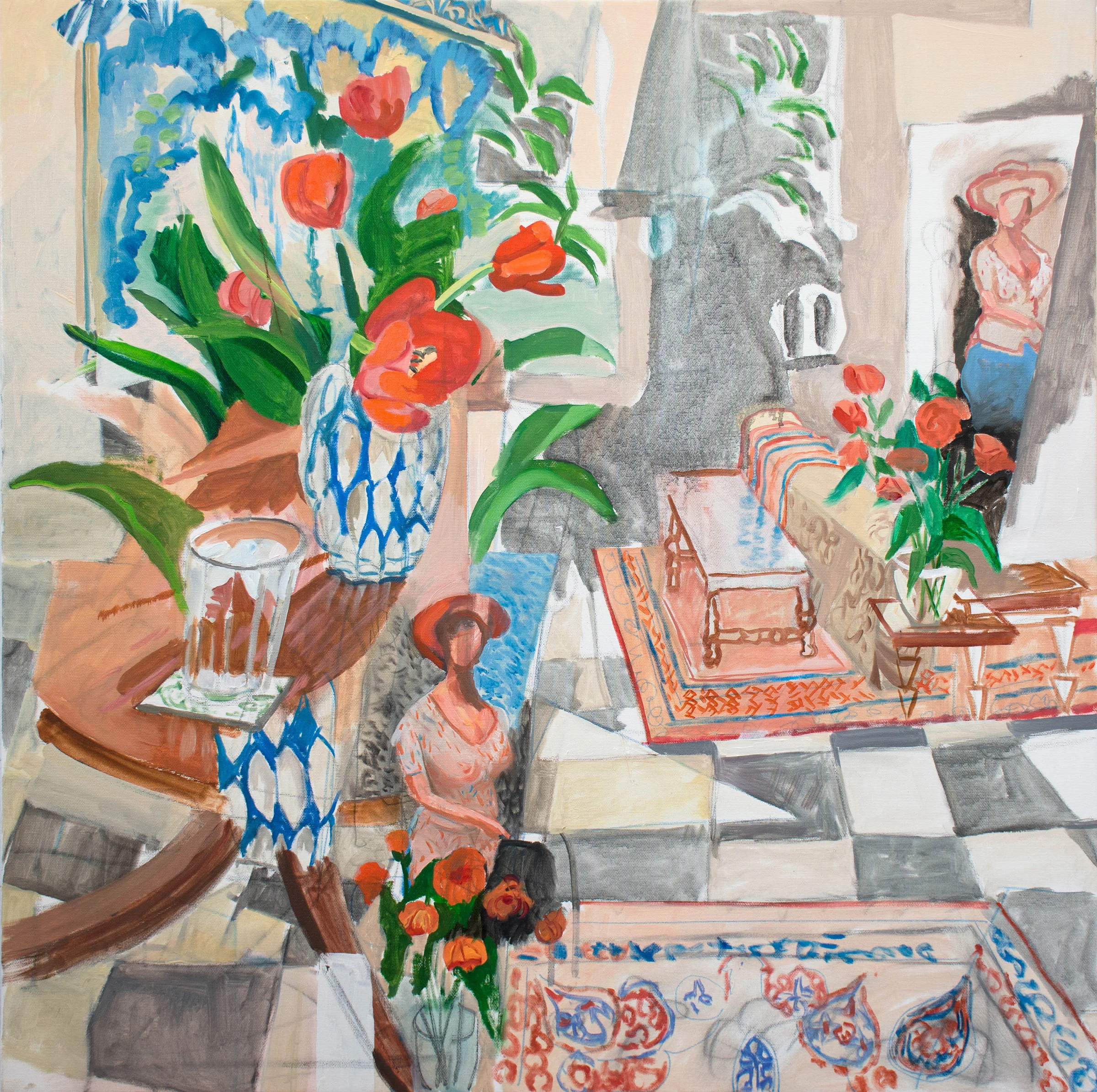
oil interior 4 before todays intervention
10:24 AM: after reworking oil interior 3 yesterday, i reviewed oil interior 4 and decided it too needs some work; too many white areas, which end up confusing the eye rather than contributing to a coherent whole picture surface.